adfsdfsfsdfsfssdfd
Designing a analytics tool people can actually understand
Snapshot
Most analytics tools aren’t designed for the people who actually use them.
They’re shaped by the team building them, usually a mix of data analysts and Dribbble-loving designers who pack the UI with complex charts and clever layouts that look great but make zero sense in practice. The actual users, busy executives don’t have the time or patience for that.
A good analytics tool should give a quick read on what’s going on, what matters and what needs attention. Not force people to dig for meaning or click through five layers to understand a simple trend.
After working closely with senior business leaders for years, I’ve learned what they actually want: clarity, sharp analysis and clear recommendations they can react to. Metrics that make sense and have a real impact on the bottom line.
With that in mind, I worked with the GYST team to rethink their user experience and value proposition.
GYST is a creator-first insights platform that pulls together revenue, brand deals, affiliate data and platform performance in one place. Their users are small, fast-moving teams without analysts. They don’t need more data and charts. They need answers.
This project focused on turning scattered data into something that actually supports decisions.
Our Starting point


The work started with a storyboard that set the tone, goals and desired feeling of the product. I then built a user flow to map every step of the experience and identify what should stay, what should go and what needed redesigning.

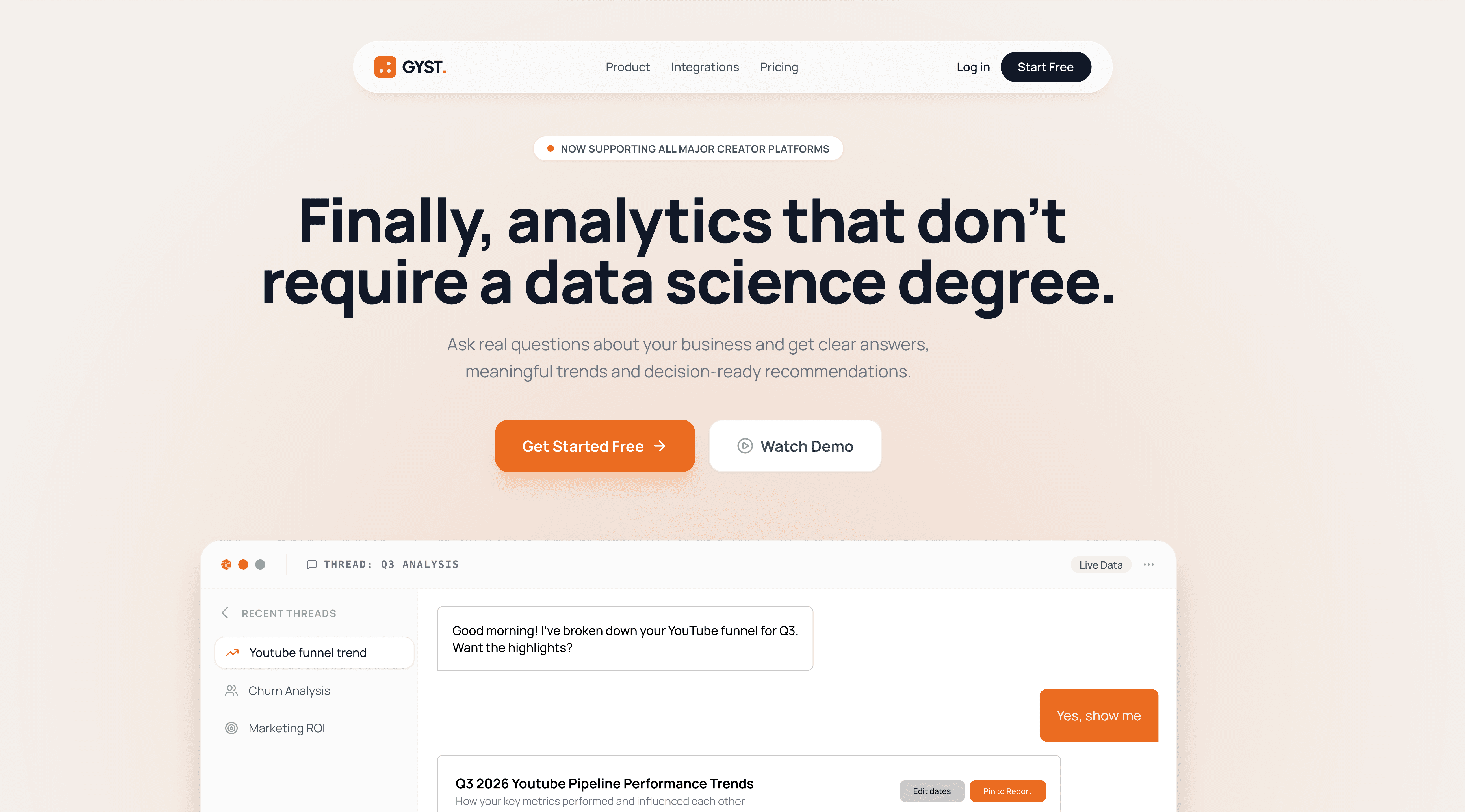
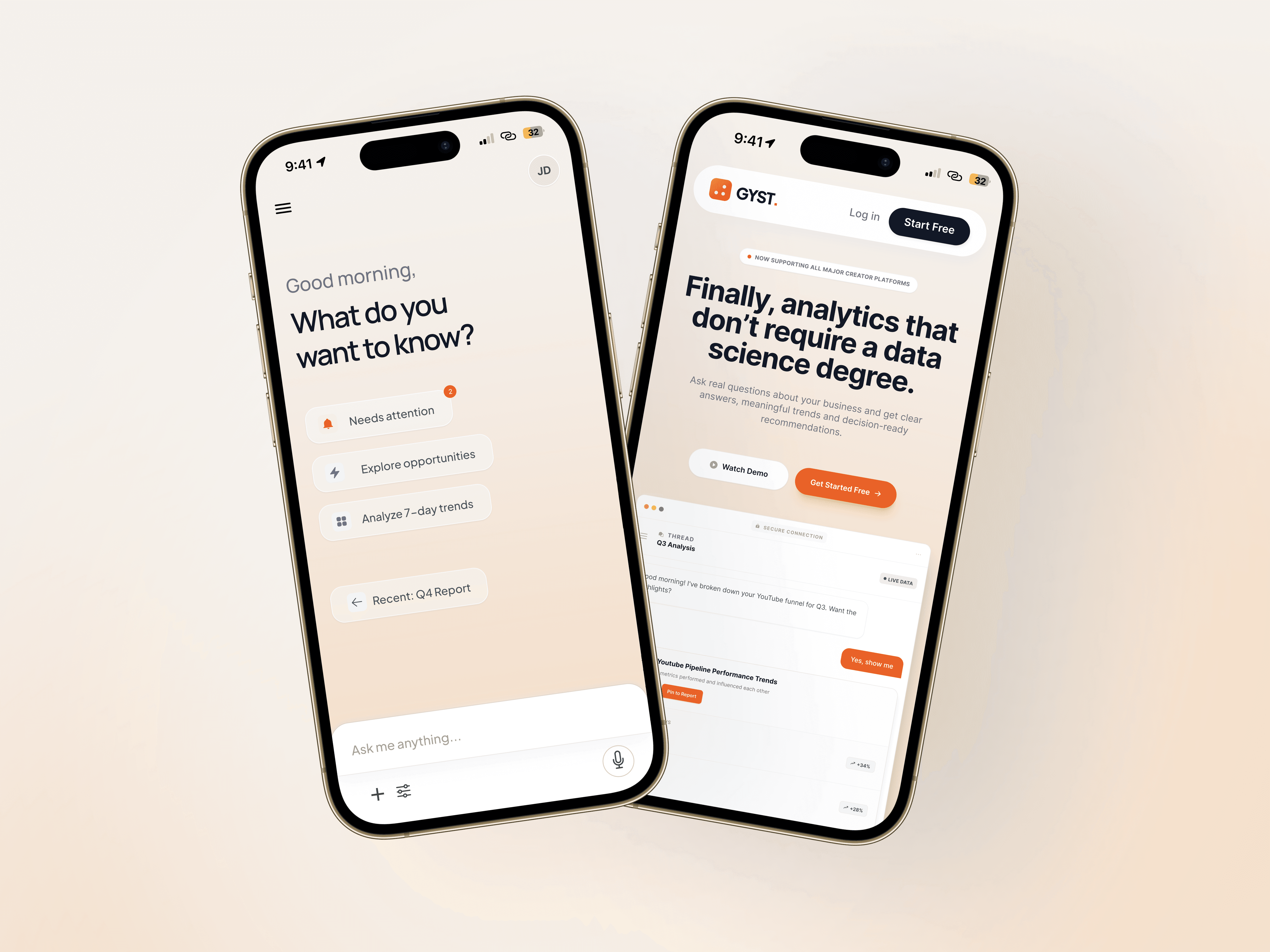
I redesigned the landing page, moving away from product-centric messaging towards messaging that reflects user pain points and the desire for a dashboard that’s actually easy to understand
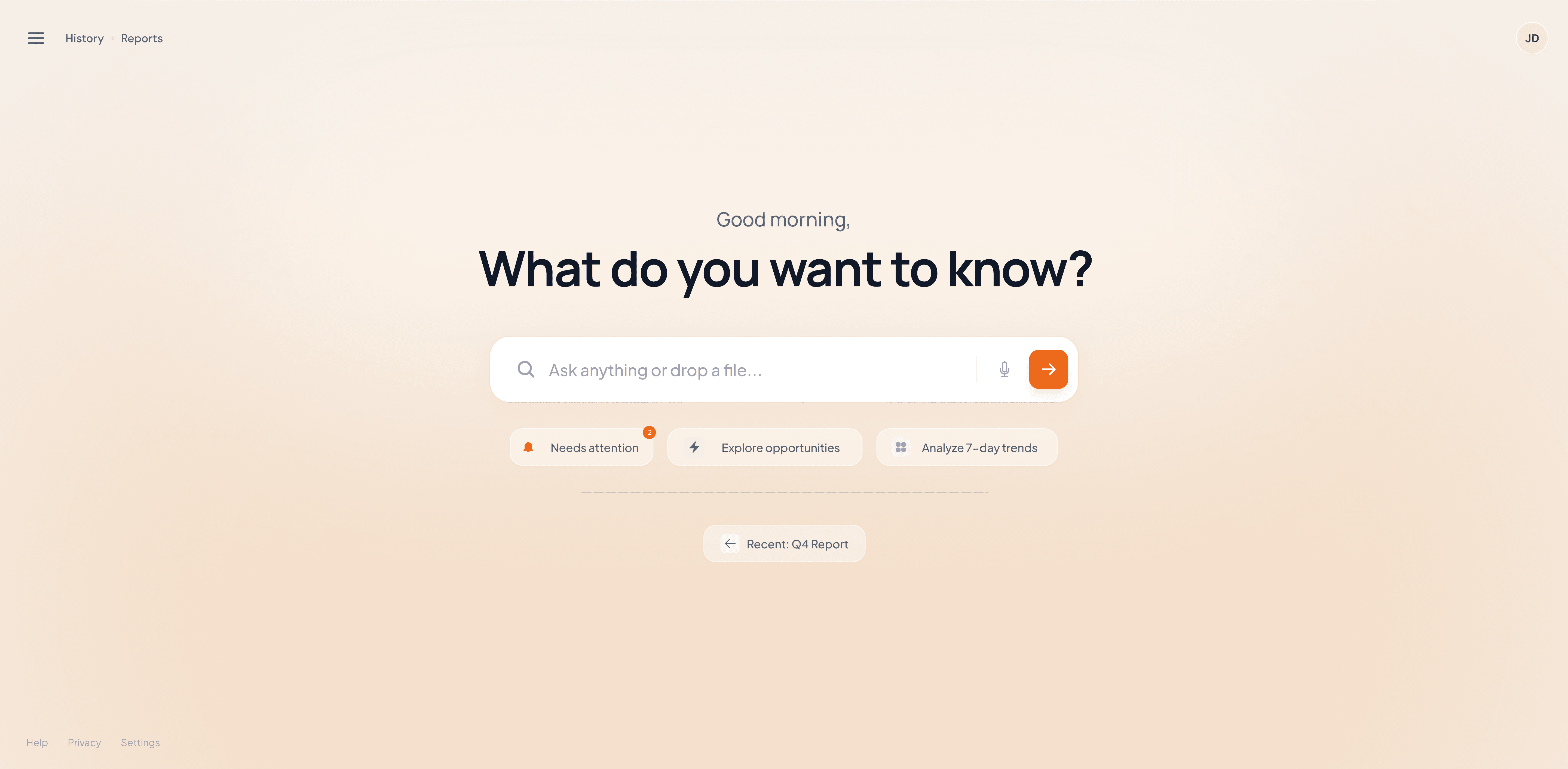
I simplified the landing screen by removing the noise, setting a clear primary action, reducing cognitive load and gave it a warmer and more comforting color palette. Users often describe dashboards as overwhelming and confusing, so the redesign focuses on clarity, calm and a single obvious way to start.


This was created as a forward-looking concept, focused on clarity and usability. It offers a realistic direction for how GYST could shift from raw metrics to insights that actually help people work smarter and how an updated value proposition would help attract new users.
See more
